A board is a place to think
Three studies in chalk, dry-erase ink, and technical drawing, built around the same experiment.
The brief starts with two colors: #111 and #eee. A blackboard and a whiteboard both invite unfinished thinking. You can write the equation, circle the surprising part, and leave enough space for the next question.
We built three interactive studies around those exact backgrounds. Each uses the same words, oscillator, and proposed component example. Changing the design should not change the experiment.
Seminar
Serif headlines bring the pace of a research article. The graph has a slightly irregular chalk edge; the annotations use a self-hosted handwritten face. Body text stays sharp. Chalk is an accent for explanation, rather than a texture laid over everything.
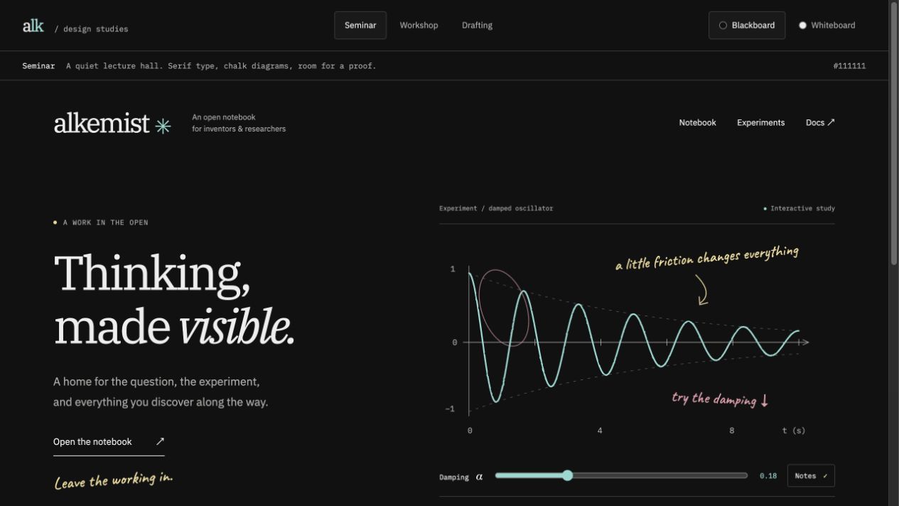
Open Seminar on the blackboard.
Workshop
This version borrows from a dry-erase board: confident blue marker, green and red notes, broad strokes, and a loose underline. Sans-serif type makes the opening more direct. A small marker tray finishes the board without turning the website into an illustration of a classroom.
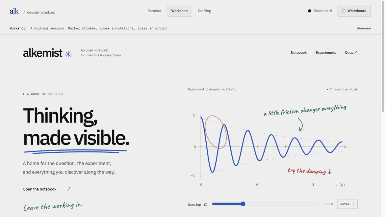
Open Workshop on the whiteboard.
Drafting
Monospaced headings and a ruled figure plate suggest an engineering drawing. Crosshairs locate the plate, grid lines support the graph, and the lower cells align the explanation, source, and capabilities. It is the most technical of the three directions.
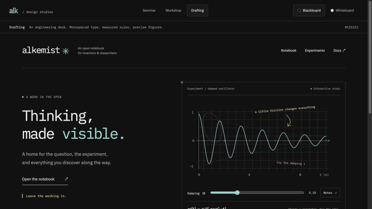
Open Drafting on the blackboard.
The experiment is real; the component API is a proposal
The study plots an analytic function, x(t) = exp(−αt) cos(ωt), with angular frequency ω = 1.2π radians per second. The damping control changes α between 0 and 0.65 per second. It redraws the same sampled function and its decay envelope. The initial curve is also rendered at build time, so it remains visible without JavaScript.
This is synthetic data, not a CSV loader or a released AlkChart. The example code is labeled as a proposed API. The Notes button controls the SVG annotations, and the URL preserves the selected design and board surface for sharing.
What we checked
All six design/surface combinations fit the narrow browser viewport without horizontal page overflow. We inspected desktop and mobile renderings, checked the exact background colors, changed damping using the keyboard, and toggled the annotations. The build checks the page, screenshots, and internal links. Screenshots above capture the built local site without its development toolbar.
These studies live in the demo app while the direction is being selected. The adopted theme will move into the reusable UI package, where articles, documentation, and interactive components can use the same tokens.